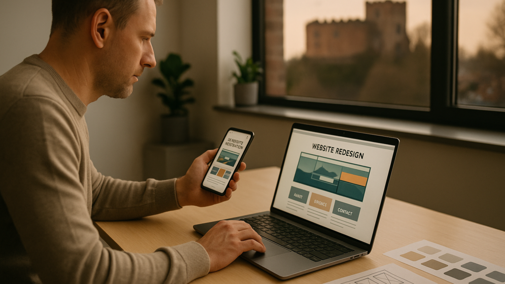
Why is mobile first so important?
As technology continues to advance, we learn to adapt to these advances and follow the trends. A good example of technological advances is the smartphone. According to Statista, there are now 6.64 billion smartphone users in the world, which indicates that almost 84 percent of the global population owns one. Statcounter shows us that as of January 2022, 54.98% of the market share of internet users are using mobile devices, compared to 42.54% on desktop computers.
With those kinds of numbers in mind, it’s easy to see why thinking mobile-first when it comes to website design is surely the way forward. And as the market share of mobile devices rises, this trend will long continue.
https://ewebz.co.uk/wp-content/uploads/2022/04/Stats.jpg
Above is a chart from StatCounter which shows the comparison of mobile vs desktop market share worldwide from January 2021 to January 2022.
What is mobile first design?
The concept of mobile first design refers to the manipulation of a website in such a way that it can be viewed on a mobile screen first, rather than a desktop computer.
The phrase mobile first is basically exactly what it says on the tin; building a website that primarily considers mobile users in the first instance. Mobile first is essentially a simplified version of your website, removing the fancy hover menus, sliders, and stylish banners. Thinking about how you can deliver your content to your visitors in a clean and simple way.
Mobile first websites are designed for smartphones first, then tablets, and then desktop/laptops computers.
https://ewebz.co.uk/wp-content/uploads/2022/02/Google-Mobile-Friendly.jpg
What’s Google got to do with it?
Way back in 2016 when mobile internet usage first overtook desktop internet usage, the developers at Google decided to employ a new strategy of mobile-first indexing. The term “mobile-first indexing” refers to indexing that prioritises mobile devices for indexing and ranking, Google mostly uses the mobile version of the website. When evaluating the relevance of a page to a user’s query in the past, the index largely used the desktop version of a page’s content.
So if your website isn’t mobile friendly or responsive, you could face penalties when it comes to your rankings on Google’s search engine results pages.
Google is changing the way its search engine ranks websites; now, if a person performs a search on their mobile phone, Google will rank websites based on their mobile usability rather than their desktop usability. Because Google is all about making things simpler for their users, and with those users primarily accessing the internet via mobile devices, it’s easy to see why this is a top focus.
Conclusion
The internet is being accessed more and more frequently on mobile devices. Designing your website to be mobile-friendly ensures that your site performs well across all devices.
Take the Mobile-Friendly Test to see how your website stacks up now that you know what all the mobile first fuss is about. You can test a single page or your entire website to discover how easy it is for a visitor to navigate your site on a mobile device and what Google’s search algorithm is searching for. If your website isn’t up to scratch, eWebz can help.
We specialise in creating websites that look great on small screens. Get in touch and start a conversation with eWebz Web Design today.
Looking for a web designer?